Essential hearing
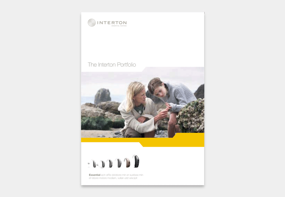
Interton wanted to refresh their visual identity without replacing their long-time logo. That called for a design expressing their brand promise of high quality at a reasonable price and reflecting their “Essential hearing” tagline.
We worked with a familiar symbol from the world of audiology – the distinctive pattern of an audiogram – and a limited color pallet consisting of yellow and warm grays. The result was an up-to-date expression that works well both on its own and as the foundation for a variety of sub-brands.


